1 Introduction
Time series data have distinct features – data are collected sequentially over time, order of observations matters and observations do not arise independently, they are serially dependent. Also, they serve many purposes, e.g. we can use them to understand or model the stochastic mechanism that gives rise to an observed series or to predict or forecast the future values of a series based on the history, and to quantify the uncertainty of predictions.
1.1 Abundance of Canadian hare
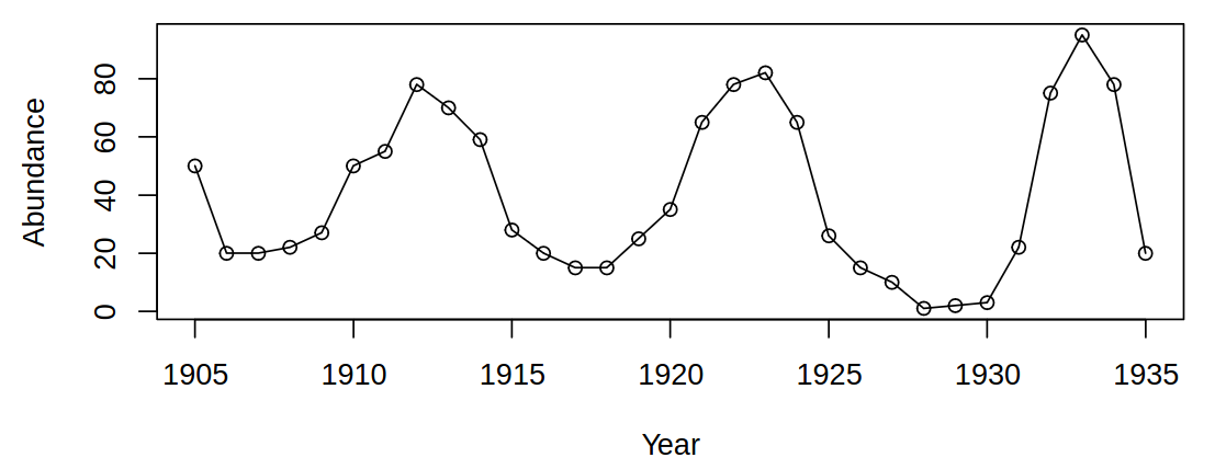
We can surely make the following observations – there is a stable level (oscillating around some stable mean) and no obvious trend. More so, the neighboring values are very closely related, there are no large changes from one year to the next. From even closer analysis a question arises – are consecutive years related? Could be useful for the prediction
It is easy to see that naive linear regression would not provide good predictive capabilities - it would predict a point on the mean line
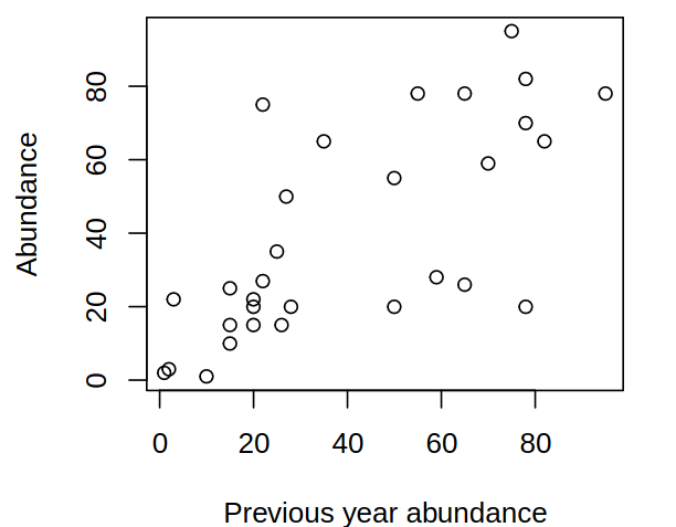
But we can also deduce from looking at year-to-year changes, that there is an obvious upward trend, low/high values tend to be followed by low/high values and there is a positive serial correlation.
1.2 LA annual rainfall
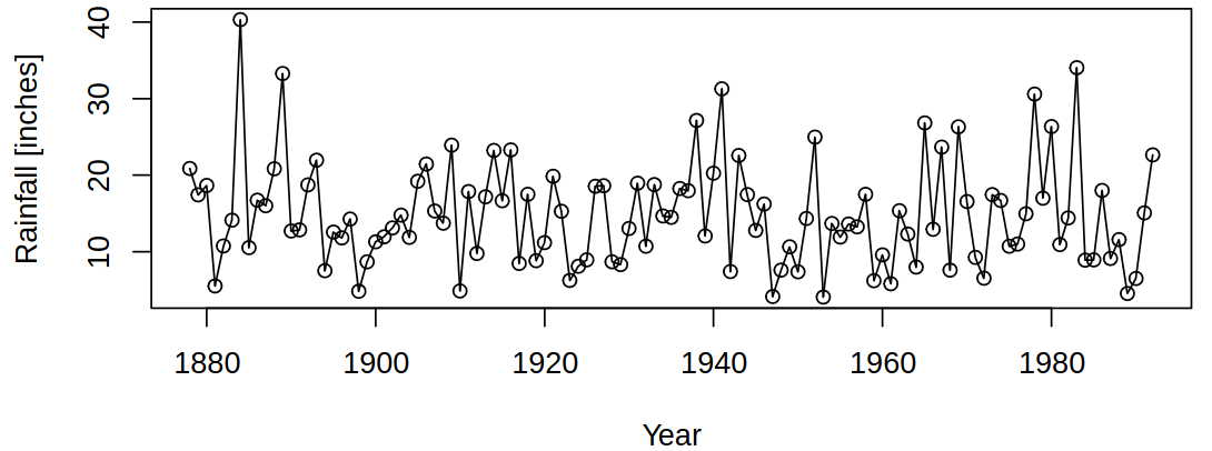
Consider now the following data about annual rainfall in Los Angeles:
And again we can deduce from the data that there is a considerable variation and no obvious trends (this can be expected a priori).
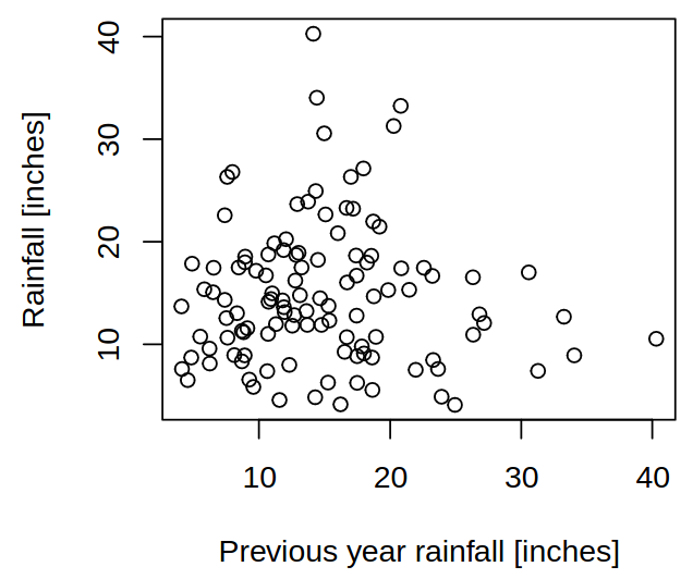
And even when looking at year-to-year changes (so-called a lag plot) it shows no general pattern, little correlation between consecutive years and hints at difficult forecasting.
1.3 Airline passengers
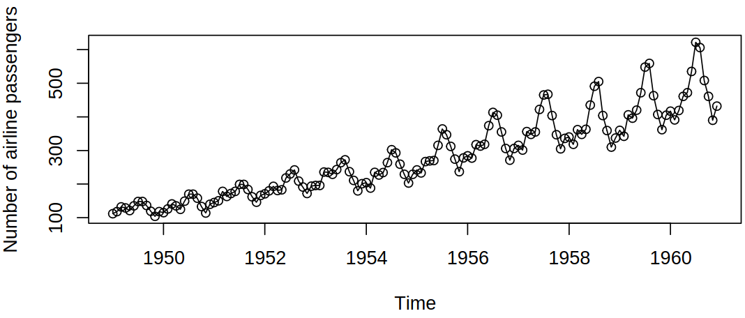
Here is another example of a time series, where this time we can see the following attributes of this data. There is an obvious global increasing trend with a seasonal pattern of behavior and an increasing variance.
1.4 CZ unemployment rate
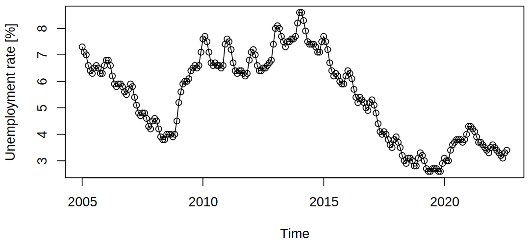
Unlike the previous example, a trend (or a tendency) can be seen here as well, but in a much more complicated manner (in a shorter timeframe, no global trends present). Though it still contains seasonal effects (“oscillations” of sorts)
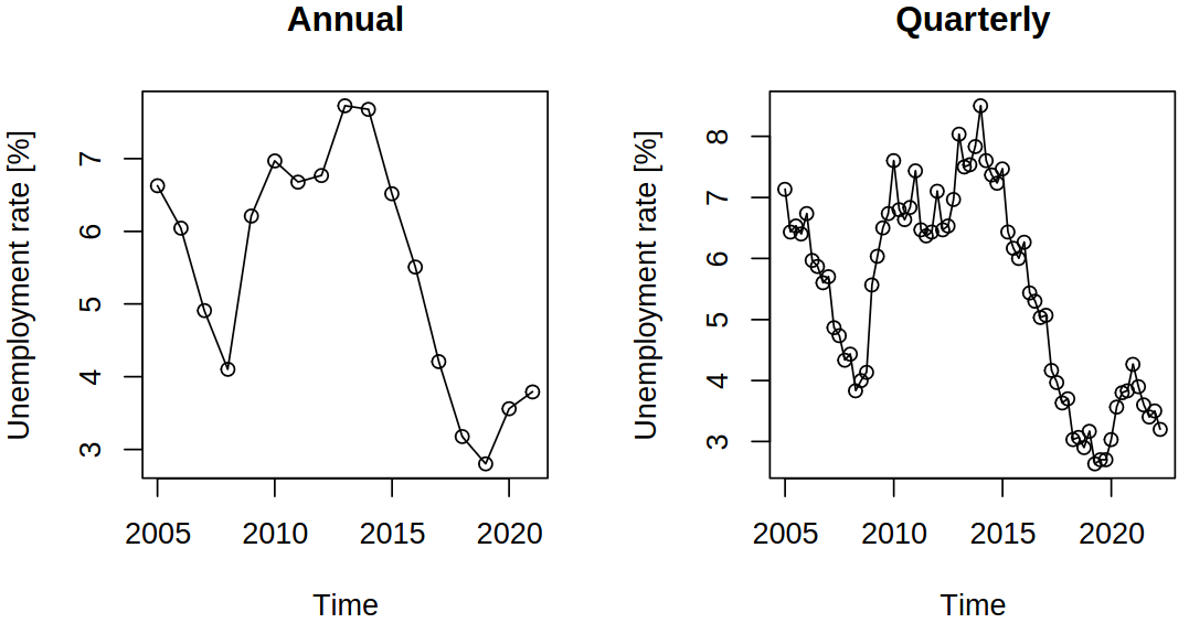
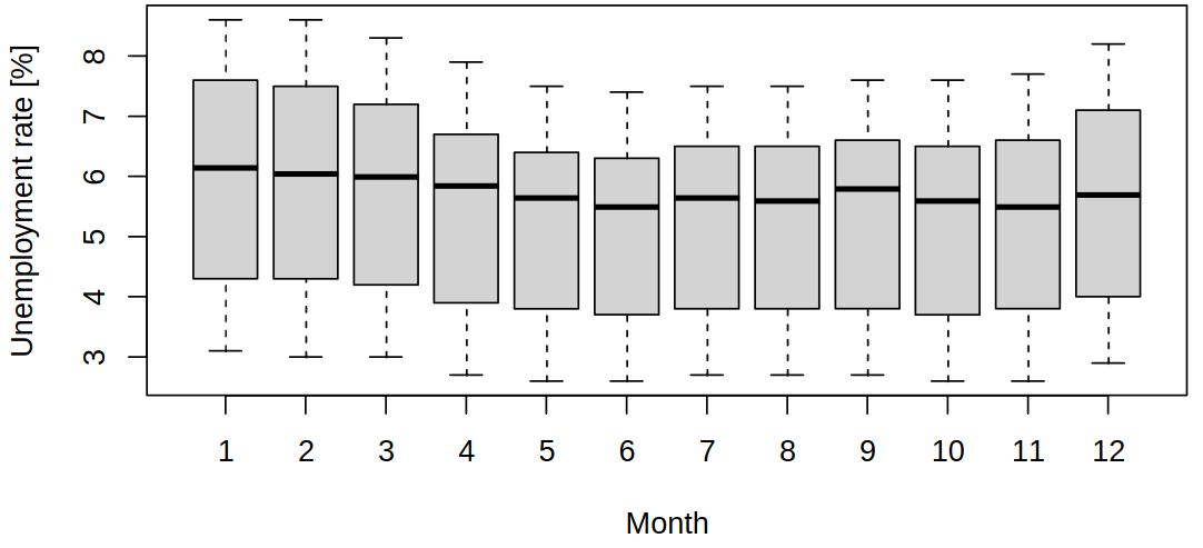
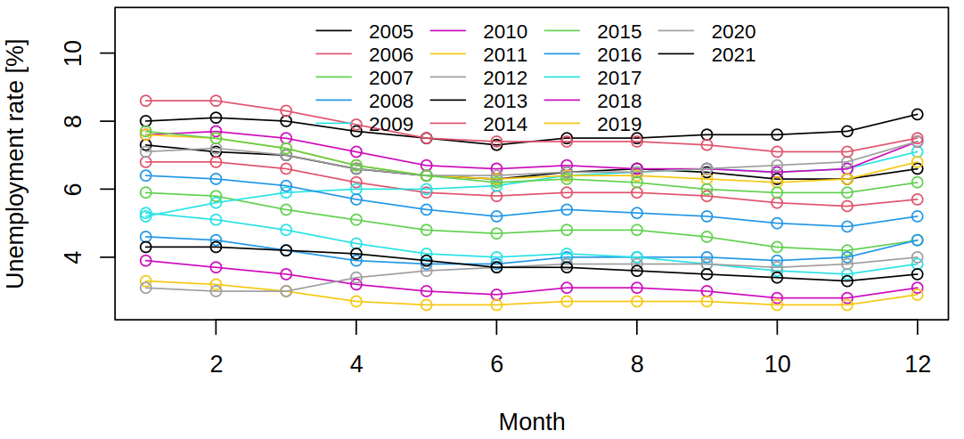
By aggregation of the data, we can preserve the overall trend, but lose the seasonal effects (which we might consider as a noise of sorts). On the other hand, we can also study purely the seasonal trends
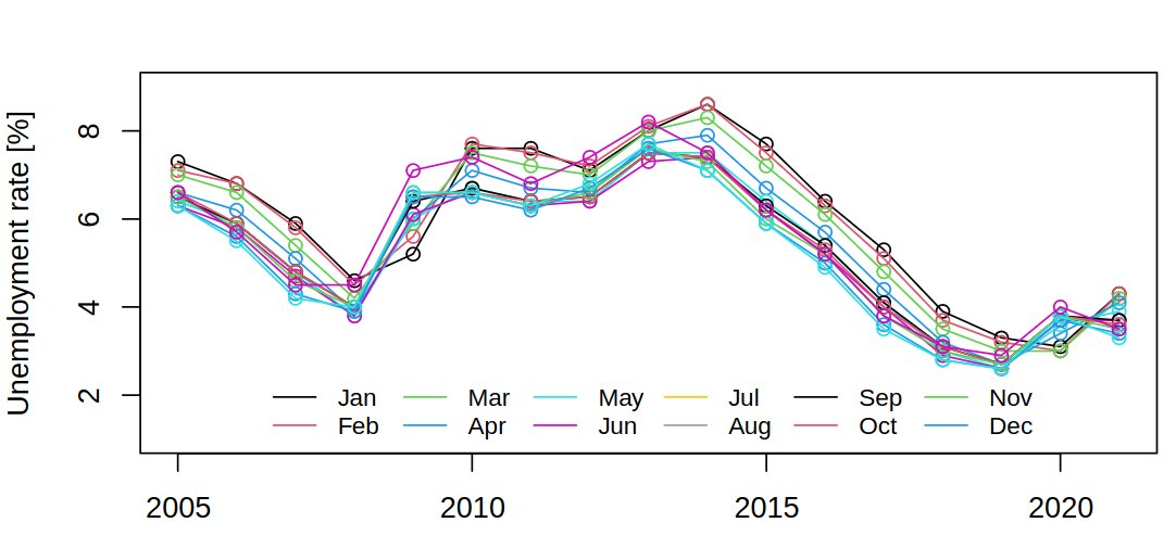
Such visualization shows variability between seasonal values and variability/trends within seasons. Also notice that summer brings a lower unemployment rate, as could be seen in the full data (but less clearly). There are multiple ways of visualizing the same data and each shows a different thing. The following plot shows a correlation between months and the outlier year 2017.
Conversely, next, we can notice the global trends and correlations between years.
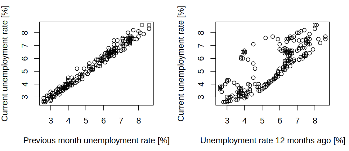
Lastly, based on this information we might want to see the lag plots, where we will see a strong correlation between consecutive values and a strong correlation between values 12 months apart.
1.5 S&P500 Index series (1990–1999)
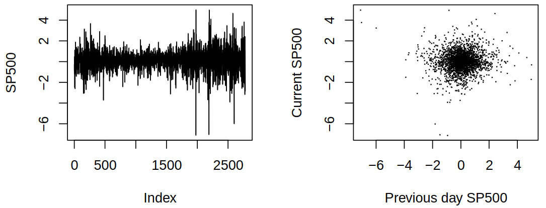
Yet another dataset shows other features of time series we can come across. Here that is a changing variance, variability (volatility), which occurs in clusters, and no obvious relationship between consecutive values. These features are typical of financial time series (next semester).
1.6 Covid-19 hospital occupancy
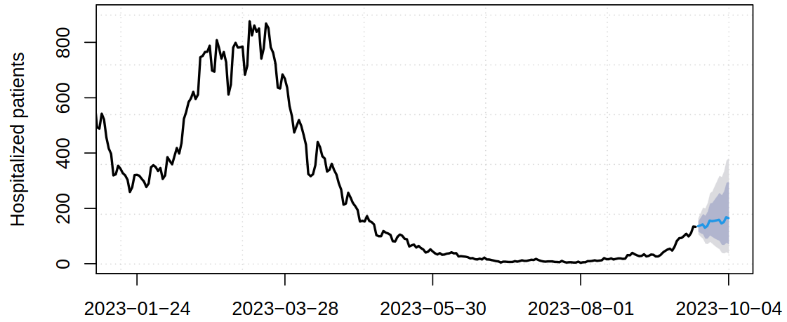
For a Covid-19 disease hospital acceptance (incoming occupancy) rate:
In this case, prediction (and decisions based on that) was the driving force behind this model and as such it needed to include prediction with uncertainty quantification
Time series analysis provides short-term predictions, rather than long-term extrapolations that require a detailed model of the underlying phenomenon.
From the Covid-19 we can see that ARIMA models (covered in this course) are still useful (and can be among the best models available).
